The power of Logos in Fast Food World
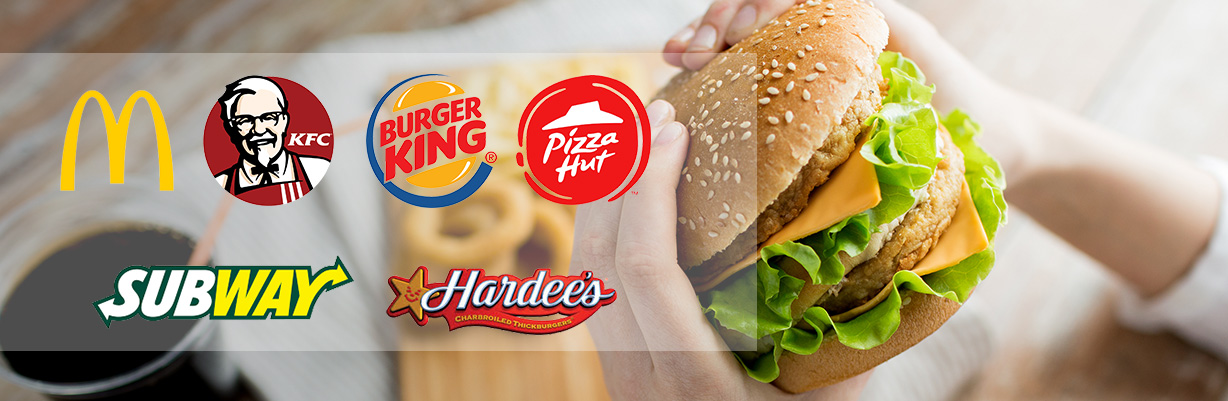
It could be argued that the most valuable property any fast food chain has, just as much as a unique recipe, is their logo. It is a well known fact that the McDonald’s golden arches are among the most recognised symbols on earth. No design could be simpler; so is simplicity the key to the success of a logo design? Conventional wisdom in the design world would seem to say so, but it isn’t always the case, perhaps confirming George Bernard Shaw’s mantra, “The golden rule is: there are no golden rules.”
One of the great advantages the McDonald’s logo has is that it is omnipresent. It is impossible to drive around almost any city in the world without seeing those golden arches at least once. Sure, the logos of other fast food restaurants are immediately recognisable, but none are engrained in the mind as deeply as those golden arches.
Every brand in the world has a logo, be it a motor car, airline, perfume or cup of instant noodles. The thing that sets fast food restaurants apart is they must be a spur to immediate consumption. All logos must have the individuality to stand apart, but fast food logos must also have a friendly familiarity that says, ‘I’m here, walk in right now and enjoy your time with me.’ This is no doubt why the colour values of most restaurant logos tend towards yellows, oranges and reds: the warm, friendly, comfort colours. The reason why logos are such a valuable asset to fast food restaurants is that they are more than a means of immediate identification – they are a ‘welcoming invitation’. Although a classic, imagine how inappropriate the Mercedes Benz logo would be for a fast food chain: far too asocial, austere and refined.
All logos must have the individuality to stand apart, but fast food logos must also have a friendly familiarity that says, ‘I’m here, walk in right now and enjoy your time with me.’
A logo in itself does not guarantee any brands’ or products’ success, but it is the most powerful single visual asset any company possesses, so its value is immeasurable. Choosing the right logo design is the very first step to establishing any brand. But what is the ‘right’ logo design? A good logo should, as best as possible, reflect a company’s personality. So how do some of McDonald’s competitors shape up?
The word ‘personality’ could not be more relevant when considering the Kentucky Fried Chicken (KFC) logo which has always featured an image of founder Colonel Sanders, whose recipe of eleven herbs and spices has long been one of the world’s most famous trade secrets. KFC’s imagery is as immediately recognisable as McDonald’s and there is no doubt that the Colonel and his perceived uniqueness, ever present in the logo, has played a key part in bringing that about.
Pizza Hut has chosen the informal approach for their logo. It almost looks as naïve as the simple brushstrokes of a child, yet this is obviously intentional. Pizza Hut is not in the gourmet pizza business, they are after almost everyone including families with young children, so an informal logo with a suggestion of fun is the order of the day.
Hardee’s whose products are in most direct competition with McDonald’s, has a logo that is something of a curiosity. The script style lettering seems rather formal and it is interesting to discover the original Hardee’s logo was in a rounded sans serif typeface. The change came about in 1997 when the restaurant chain Carl’s Jr. acquired Hardee’s, and the ‘Happy Star’ logo was also inherited. The star seems to ‘de-formalise’ the type element of the logo and invest it with a friendlier feeling.
It is no surprise to see the Subway logo is very different – their product is. Created to offer the loved submarine sandwich, Subway nailed their colours to the mast by adding the words ‘eat fresh’ beneath the logo, and as the world grew more and more health conscious, Subway has grown exponentially over the past decade. Subway is the only fast food chain logo of those mentioned here that is type only, the two arrows being enough to give it distinction. What do those two arrows symbolise? That’s up to you. I have always interpreted them to mean fast service.
What can we take out of all this? Logos are fascinating things – and crucially important. A logo is every company’s ever-present calling card, and if people love your calling card, you are already at a massive advantage. What an iconic logo is actually worth is beyond evaluation.
John Oldfield is Regional Creative Leadership Officer at Pirana Advertising and author of the recently published book ‘How to Protect Your Bottom Line from Your Advertising Agency’. john@piranagroup.com
The article was originally published in Aurora
Previous Article
« Get a panoramic view of your data with dashboardsNext Article
Ad- Review- Campaign which Beats by your Heart! »-

Pakistan Advertisers Society Organized The Third Edition of The Pakistan Young Lions Competition
Posted On February 27 2024
-
Spotlight: Creative briefing – using AI to stoke EI
Posted On March 22 2024
-
PAS held its 26th Annual General Meeting and elected its new Executive Council
Posted On December 6 2023
-
Pakistan Advertisers Society Organized The Third Edition of The Pakistan Young Lions Competition
Posted On February 27 2024
-
PAS held its 26th Annual General Meeting and elected its new Executive Council
Posted On December 6 2023
-
PAS Simorgh Award 2023
Posted On December 15 2023